What I learnt as a Masters in Organisational Psychology after working in UX Design for 2 years
Whilst working as an Experience Designer here at Sitback, I’ve started to understand how behavioural science is applied in design. So, to better illustrate what I’ve learnt and seen as a psychologist in UX, I’ve put together some insights I’ve picked up along the way.
Design for users, not for interfaces
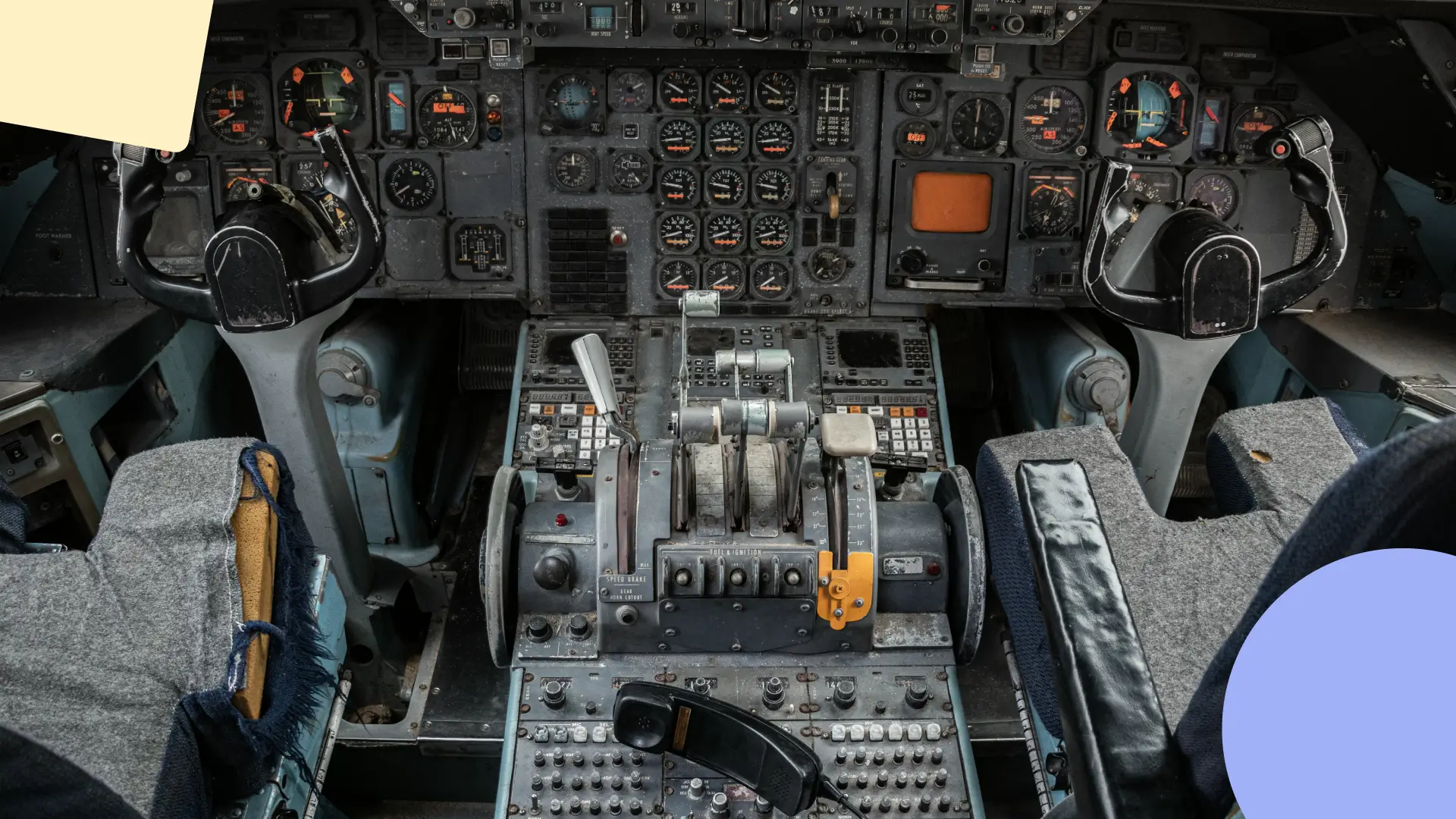
Back in World War 2, the Boeing B-17 “Flying Fortress” was a symbol of American ingenuity – aesthetically pleasing, packed a punch, and could take a bashing and make the return journey safely (hence the name). However, there was something strange that kept happening. There were thousands of accidental crashes in what should have been routine landing procedures. At the time, this was attributed to “pilot error”, and the mystery case was handed to psychologists Alphonse Chapanis and Paul Fitts (who would go on to develop Fitts’ Law, a key principle for human-computer interaction). But was this the case? Was the military just undertraining, or hiring incompetent pilots that couldn’t learn controls?
After some investigation, they found the issue lying within the design of the plane controls. The landing gear switch and the wing flap switches were identical and placed right next to each other, so pilots would accidentally retract their landing wheels when they wanted to slow their speed and land, a deadly mistake that only needed to happen once to cost lives. For the first time, this failure in human-interface interaction was attributed to “design error”. Instead of attributing it to humans that couldn’t learn about their machines appropriately, Chapanis and Fitts applied a different perspective, one that suggested that machines should be designed to fit the human.
I was taught this piece of history in my Masters of Organisational Psychology course, about how the field of user experience was partly developed through psychology and behavioural sciences. We’ve kept those same principles and increasingly applied them to “human-centric design”, a philosophy that strives to understand the user’s emotions, behaviours and wants through the scientific method. Of course, we employ this mindset at Sitback, where we complete customer research and experience design, to create and inspire exceptional experiences.
This is pretty foundational for user experience, but it’s a good reminder to remember who you’re designing the product for. Take the time to understand your users, validate your findings and don’t let pride get in the way by attributing design flaws to user errors.
Design for mental models within
We make about 35,000 decisions a day, which is a staggering amount, but imagine going onto an e-commerce website to look for a pair of shoes. The only way you navigate through a website is to make decision after decision – and fingers crossed the user experience of your imaginary site is good, or you might have to make a frustrating amount of decisions. The study of behavioural science tells us that in trying to save on cognitive load, our brain takes shortcuts (also called heuristics) to make fast, efficient decisions, but oftentimes this decision-making doesn’t lead to the rational result. As such, I’ve learned that people don’t always make rational decisions, and so we shouldn’t design as if they do.
Here are a couple heuristics I learnt, for example:
The aesthetic-usability effect
This effect has its origins from the attractiveness bias, which says that the human brain evaluates based on looks when there isn’t other information available. There’s a wide body of research that says attractiveness increases people’s chances of being hired and accepted into schools. In one experiment, 5-year-old children were presented with photographs and asked to pick which candidate they’d want to be their imaginary boat captain. Unknown to the children, the photographs were of French politicians. The results of that experiment were not only that the children often picked the more attractive politician, but that their choices predicted results of political elections with an accuracy of 80%. When you aren’t presented with a lot of variables to evaluate a person with, your brain has to resort to judging and attributing value based on looks.
This effect has been applied towards websites and digital apps as well – it’s found that more aesthetically pleasing interfaces are given higher usability ratings by users. And this evaluation occurs unconsciously and quickly.
This often means that after doing the research, and talking to users and stakeholders alike, it’s important to consider the balance of functional and aesthetic. This balance is still something I’m trying to perfect, and trying to adapt to as design trends are constantly changing.
The IKEA effect
This behavioural science heuristic describes how when people build or make something themselves, they end up irrationally valuing items more highly because they feel a sense of ownership of them. One historic example of the IKEA effect is when cake mixes were initially produced, they weren’t well-received as consumers thought they made cooking too easy! It made the process unsatisfying, and consumers felt the same as if purchasing a store-bought cake. Manufacturers then changed the cake mixes so that they required adding an egg to bake, which then skyrocketed sales of the new formula.
We can see the IKEA effect being employed to great effect in DIY cooking kits like Hello Fresh, or other products like Build-A-Bear. The journey is as important as the destination! Sometimes letting users do some of the work can provide them with a better sense of fulfilment and user experience.
There are so many more heuristics out there, and excellent online resources such as Coglode, and The Decision Lab. Deciding which heuristics to look at and apply may be daunting at first, but what I’d like to emphasise is simply to apply a bit of behavioural science perspective, and consider the underlying mental reasons people may behave with your product or website.
Design for good, not just for effectiveness
Unfortunately, behavioural science can be also used to guilt, misinform or outright trick users into behaving as the designer wants them to, even if it’s contrary to what the user would actually want to do. Because they still match our mental models, these tactics are effective, but once they’re known users are likely to call the behaviour out. We’ve come to know these methods as “dark patterns” in UX. Dark patterns are defined as “a user interface that has been carefully crafted to trick users into doing things, such as buying insurance with their purchase or signing up for recurring bills.”
In recent times, dark patterns have been developed to become more subtle and can trick more savvy users as well. Here are some examples – would these patterns have made you fall for their tricks?
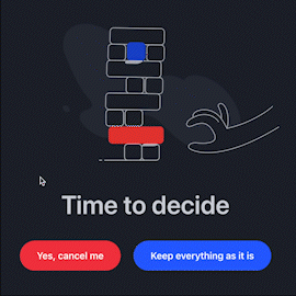
People would way rather keep things the way they were, and hate feeling like they’ve lost out on something good. TradingView tries to leverage this status quo bias through this animation and the colour red to try their best to dissuade and “confirm shame” their user into not unsubscribing.
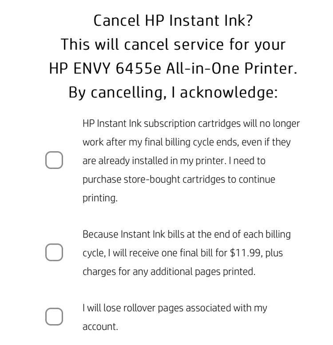
HP uses a “Trick Question” dark pattern, which at a glance asks you one thing, but then if you look carefully… if you accepted these terms, not only are you agreeing that your currently installed cartridges will no longer work, you also forfeit any rollover pages you might have, and any additional pages you want to print will cost you extra.
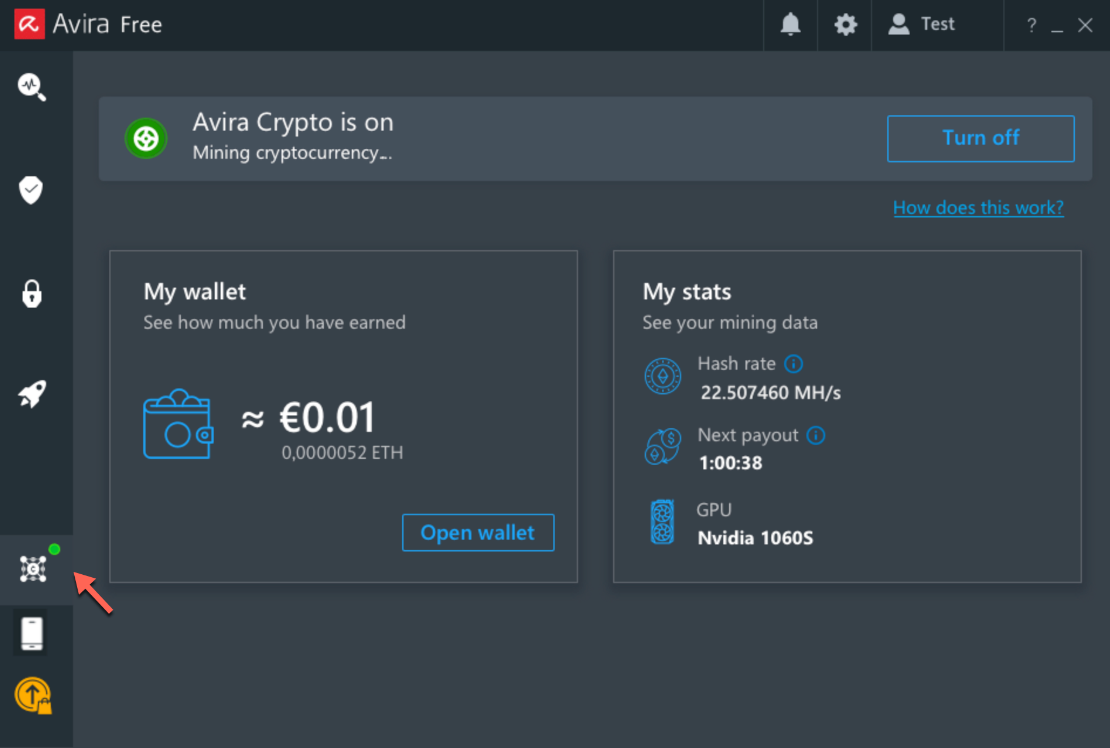
Avira antivirus installed a cryptocurrency miner as part of its software program without informing the user, The user would have to opt-in to active the miner, but having something unexpected installed alongside your antivirus software is misdirection and a clear breach of the user’s trust.
Unfortunately, the use of dark patterns often comes down to the company and designer’s moral code. As a psychologist, I’m bound by a code of ethics, so understanding how behavioural science is wrongfully used to manipulate users helps me understand what to avoid in my own designs as well.
The good news is that this malpractice is being increasingly recognised and punished. In 2014, LinkedIn was penalised with a $13 million USD fine in court for using spam emails which were extremely difficult to opt out of, to follow up with users and artificially grow their platform.
Conclusion
To be frank, I’ve just started learning about the many ways that my Masters in Organisational Psychology can be applied to the wide world of experience design, and I’m constantly taught by my team’s various perspectives at Sitback as well. At its essence, my approach to design is having empathy and understanding people, whilst trying to use empirical literature from behavioural science to design a genuinely enjoyable, good experience.