How to ensure your customers love your insurance self-service portal
If there is one thing we know, it’s that now – more than ever – insurance companies need to meet the needs of consumers to grow and retain their client base.
Millennials have grown up in a world where they have access to services at the tip of their fingers, whenever and wherever they want them. They’re less comfortable on the phone (or visiting a shopfront) than previous generations, and they want to have easy access to information and spend their money on brands that really ‘get them’. And that’s even before we consider Gen Z who are, by their own admission, dependent on the internet (their identity is inextricably tied to it), and of whom 63% believe that all shopping will take place online in the next 10 years, according to WPEngine’s latest research on the upcoming generation.
So what does this mean for you?
It means there is a way to meet the needs of this group (and others who have adopted similar, digitally savvy habits) and that involves your insurance portal.
A better experience for the consumer = love for your brand
By now you know that providing access to a portal reaps many benefits for your business and the customer, but the experience your customers have via your portal will go a long way to determining if they remain customers in the long run. For younger audiences in particular, feel-good moments with brands are important – they want to spend their hard earned money with businesses that they feel understand them and make their lives easier. Ultimately, they want to feel empowered.
“The way to compete and win today in almost any industry is through your customer experience. Better experiences deliver better Net Promoter Scores which link to better retention, lower churn, and higher profitability. Well designed and executed portals deliver your customer experience consistently, at scale, and for marginal incremental cost. Increasingly important for the insurers we’re working with, volumes that switch to the portal replace traffic in the call centre allowing them to redirect that resource or more commonly reduce costs by reducing headcount.”
Simon Rowles, Managing Director, Beyonde
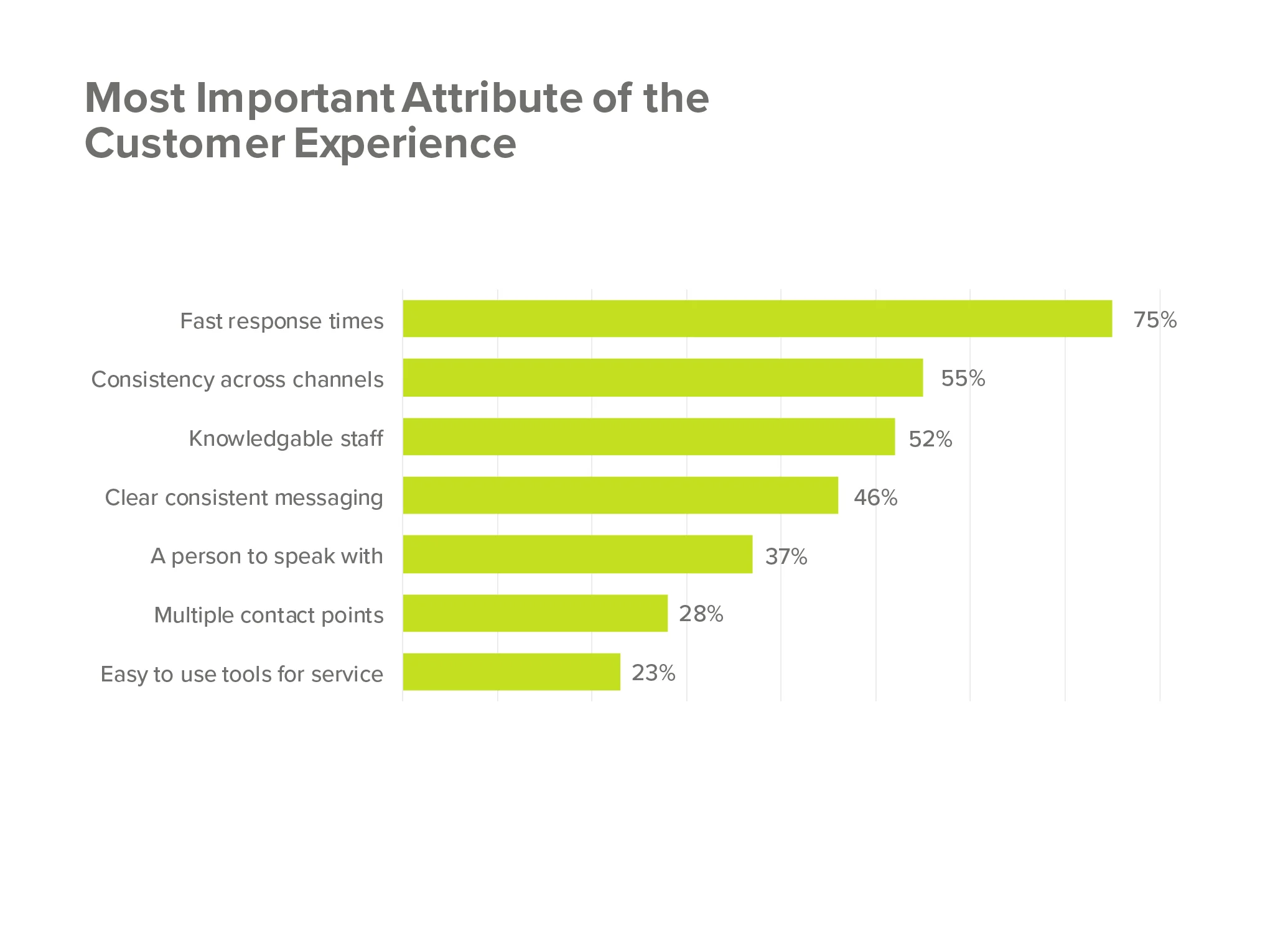
But surprisingly, 55 per cent of customers find web self service portals difficult to use, so with that in mind, we’ve put together a list of some of the most important features we recommend for our client’s platforms.
Add to your omnichannel experience
There is little more jarring than having a great experience via one channel only to have a difficult time accessing information via another. Yes, mobile and desktop versions of sites and apps should look different as they serve different purposes, but they also need to be cohesive – users should be able to access your portal from any device and still have a positive experience. This also extends into customer service – be it on the phone or via live chat – meeting your customer’s expectations of a seamless, easy transaction makes for a memorable experience (for the right reasons). Your portal can go a long way towards bringing all of these elements together.
“Digital-led companies challenge Australian organisations to overcome the burden of their legacy systems and processes, and provide a compelling omnichannel experience that remains reflective of their traditional brand…This empowers staff to provide a brand experience that is tailored to meet customers’ individual needs independent from the channel they choose to engage through.”
Go hard on self-service
This is especially important for millennials and users that are used to accessing information on the run. A portal that is easy to use, is accessible via mobile, and can be used at the most opportune time for the user will significantly improve their experience with your brand.
A well designed portal will also reduce reliance on customer service staff, saving them time on problem solving tasks based around the platform. In fact, 39 per cent check a company’s FAQs first when they have a question, which shows a preference for finding a solution themselves, so this goes a long way to delivering the experience they want and need.
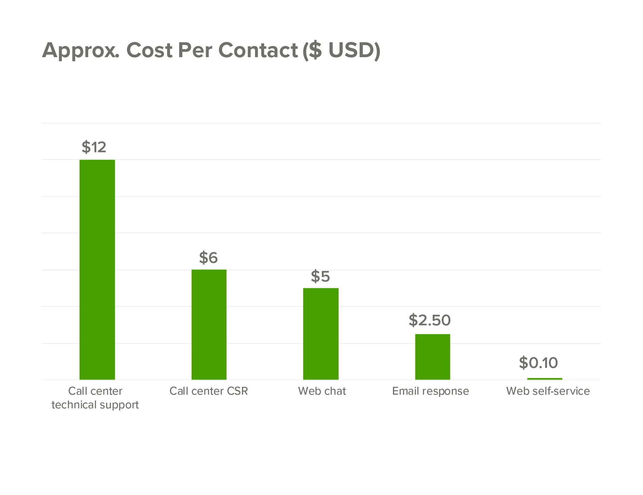
An in-depth study by Forrester Research and Oracle found that implementing self-service can reduce the cost per call by up to $11 when utilised as part of support in multiple customer service channels.
Understand pain points & resolve them
Does your customer have multiple policies? If so, they should be able to access them from the same portal for the sake of simplicity (and retention). Do they have multiple family members on the one policy? If so, there will likely be a need for multiple levels of access – an account holder might need the ability to change policies and update billing information, while a secondary user might just want easy access to online appointment booking or to check their cover inclusions.
Customers who are new to insurance often need the process of researching, purchasing, and claiming broken down into a simpler method. For example, providing tools that assist with quoting and information can have a big impact.
Mike Bartlett, Commercial Director for Sum Insured, Australia and New Zealand’s leading insurance contents replacement cost research group, highlights the importance of getting your sum insured values correct for property insurance, particularly given the increase in the severity and frequency of extreme weather events, “accurate sum insured values are the cornerstone of good insurance coverage, underestimate the value of your home contents and you could be left thousands of dollars out of pocket at claim time, overestimate and your throwing away your hard-earned cash!”
Most insurance companies recognise this and the majority provide their customers with some good home contents cost calculators, that really help to overcome the underinsurance problem.
“Users definitely want the process to be quick and easy, so insurers should be working towards integrating this functionality directly into their quote or renewal process, such as via an API. Most importantly, however, is that users still want to be in control, so help your customers determine a sum insured value, but as far as possible give them the final decision on the level of cover” said Bartlett.
Understanding the needs of your customers, and delivering on them, improves conversion and increases chances of retention in the long term. Customers are less loyal than they once were, so creating a seamless experience for them during their time with you is vital.
Ensure language is accessible
Financial products like insurance can be confronting for consumers who are not savvy when it comes to the language used in formal documentation. While there may be a need for this style of language in public disclosure statements, the language used on your websites and within your portal should be plain English to ensure potential (and existing) customers know what their entitlements are and how they need to proceed to the next step – be it signing up for a policy for the first time, adding another policy to their portal, or making a claim.
Match experience to behaviours & attitudes
These can change depending on the life stage your customer is in. Young singles might not need to interact often, but as they grow older and start a family, they will likely need to access a portal more regularly, or they might purchase pet or home insurance, or worry about job stability and investigate income protection insurance. Understanding your audience and providing the right information, at the right time, means their experience with your brand can extend throughout their lives.
Remember, data is vital
A well-planned portal should allow you to track user activity and give you meaningful insights that allow you to use your data to develop a 360° view of your customer. This might come in the form of cross-sell and upsell opportunities, or tell you when a customer is disengaged – if they haven’t accessed the portal in a number of weeks or months – allowing you to alert customer service to make contact and (ideally) save yourself a customer.
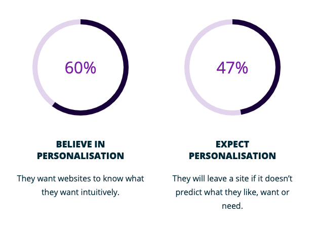
Additionally, we know that younger users expect personalisation and will leave a site (or app) that doesn’t predict their needs. If ever there was an argument for better data management, that would be it.
Don’t forget about your brokers & customer service team
A better portal serves more than just your customers. Being able to find the right information for customers means that brokers can make solid recommendations for their clients, and that your customer service team can help users access the information they need, fast. We recommend considering these two groups when determining user journeys and personas for your portal.
A case study: Health Partners
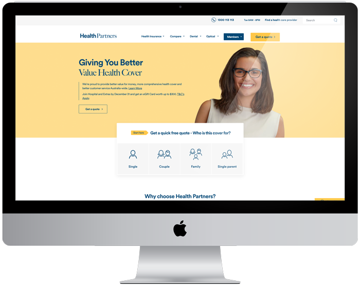
Health Partners reached out to us for help making their portal more user friendly and empowering members to self-service their policy online. We approached the project with a design thinking methodology, underlaid with data to deliver them the best possible solution for their particular needs.
Our philosophy is based around continuous improvement, rather than major overhauls (although we can do that too if your need is urgent – hit us up if that’s the case ) the “think-big-start-small-move-fast” mentality suits many of our clients and allows incremental changes to occur over time that add up to big results. With Health Partners, we were able to determine which existing features and functionality were working well, and design additional enhancements that optimised the experience for customers.
Our UX team are psychologists and HCI experts, which allows us to really get inside the heads of potential customers. For Health Partners, we undertook significant research to understand the needs of their members, especially the younger customer-base Health Partners was hoping to engage, and created ideal user journeys and personas, to provide a solution that built upon existing features that were already working well.
Health Partners now have everything they need for a ‘person-based’ digital member experience that is accessible, consistent, and aligned to the company’s strategic direction, while empowering members to self-service their policy online.
“For years now Sitback has been focused on UX and technology as opposed to the typical agency services of branding, creative and advertising. This makes us acutely aware of the importance of the end user experience which is key to any successful self-service platform.”
Paul Armstrong, Founder, Sitback
The downside to an amazing portal?
The ability for customers to leave! A great portal, built off the back of top-notch UX will make it easier for a dissatisfied customer to end their policy, but we’re confident that the chances of someone leaving will be greatly reduced if they feel empowered by what they can do and the information they get from the portal.
At the end of the day, the benefits of a great omnichannel experience and customers that love your brand far outweigh the small amount of churn that might occur (and even those users will leave having had a positive experience in that instance, which reduces the likelihood of negative word of mouth).
So what’s next?
Now that we’ve talked about the benefits for your business and your customers, it’s time to start planning your insurance portal. The way people buy insurance is changing, and getting ahead of the game could give you the competitive advantage you need (tip: we’ve got another great article covering 6 psychology principles to improve insurance website UX here).
If you’re interested in learning more about UX, our “think-big-start-small-move-fast” mentality, or how you can start improving your insurance portal, reach out today.

