How People’s Choice built and launched a member-driven site with Sitecore
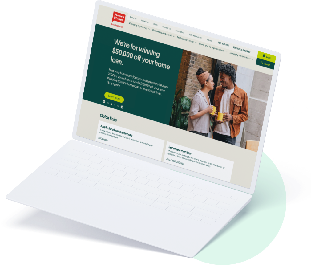
People’s Choice is an Australian credit union that have been empowering members to create the life they want since 1949. From home loans to transaction accounts, and from insurance to personal loans, People’s Choice makes it possible for members to cover all their financial needs in one place.
The challenge
Following the development of their member experience maps in partnership with Sitback, People’s Choice further engaged Sitback to carry out the redesign of their new website to bring their new understanding of both member and non-member needs to life.
The outcome
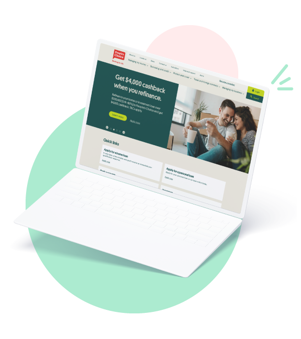
Leveraging Sitecore, an enterprise-level CMS, Sitback partnered with People’s Choice to create a member-centric website that delivers on core business and digital transformation requirements.
Following the launch of the new site, visitor engagement, bounce rates, session length, and repeat visits have all improved. Most importantly, the number of members getting in touch with advisors has increased resulting in greater home loan applications.
Behind the scenes, People’s Choice’s internal UX team have been upskilled and coached, whilst editors have gained complete flexibility in how they create new content and campaigns while staying completely on-brand.
Angela Tan
Product Owner of Member Management, People’s ChoiceInvesting in the right member experience
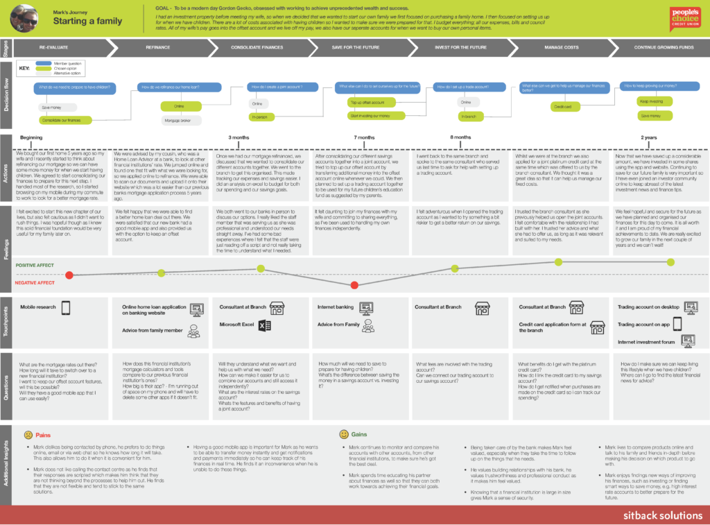
In 2018, People’s Choice — Australia’s second-largest member-owned credit union — engaged Sitback to support the digital transformation efforts of their Member Experience team. In addition to developing member experience maps based on member journeys, service blueprints, and staff personas, Sitback conducted training and upskilling for People’s Choice’s internal teams to increase UX capability and created a research matrix and research toolkit guide to streamline future research efforts within the organisation.
Following the success of this initial engagement, inviting Sitback to conduct a website redesign based on its research was a natural next step for People’s Choice. “Once that piece of work finished, we moved on to an engagement around the website, bringing those member journeys and mapping them onto our website, doing member testing, and understanding what people — members and non-members — look for in a website,” explains Angela Tan, Product Owner of Member Management at People’s Choice.
“Sitback’s work articulated for us where the pain points were in our current state, and it gave them a good understanding of our business, our challenges, and the way we engage with our members,” she continues. “Their intimate knowledge of our business really helped them to help us drive the redesign of our website. They really understood what we were trying to get to.”
The move to Sitecore: a modern CMS
Chief among People’s Choice’s goals was the desire to move to an enterprise-level content management system (CMS) that would support their future growth. “Originally, we had two CMSs — one that was very old, and one that was fairly new and still fairly modern,” explains Tan. “But it was not a very streamlined or efficient way of managing content and processes for our retail members and engagement solutions. So the first thing we wanted to do is consolidate to one CMS.” Integration with Salesforce, People’s Choice’s customer relationship management (CRM) software, was also a priority.
Further, she notes, “We wanted an enterprise-level CMS that would take us into the future and allow us to grow and scale. When we look at where we’re heading as an organization, we’re about to ramp up on our growth strategy. It was also about empowerment for our marketing team. We wanted them to have a lot more ability to move according to the market needs, or according to our customer needs. If there’s a trend they want to explore, they should be able to do that without having to rely on someone else’s schedule.”
With these needs in mind, People’s Choice conducted a request for proposal (RFP) process and completed demonstrations with several CMS providers. “From there,” Tan states, “we had a selection panel, scored the solutions accordingly, and then I put up a business case to the executive team. And from there, we made the decision to move forward with Sitecore.”
Driving improved performance through custom Sitecore development
“Sitecore was a great fit for People’s Choice and the ideas that Sitback had,” comments James Barrow, a Sitecore Technical Account Manager who worked closely with People’s Choice and Sitback on the project. “It provides a truly dynamic component design structure that will provide People’s Choice the ability to build any number of different pages. Being from a technical background, I appreciate the ease in which Sitecore Experience Accelerator (SXA) can provide functionality to make widespread design changes with the use of themes and page or partial designs.”
Building custom components in Sitecore Experience Accelerator
“The main benefit of the SXA components in Sitecore was that we could create new components for People’s Choice without writing any code,” explains Kamruzzaman Titu, a Technical Lead at Sitback.
In addition to building several custom components for People’s Choice, the team at Sitback produced multiple rendering variants for each component. This meant that the same components could be used to display the same information in different ways across their site. Titu gives the example of a component that was created to display an image and text together. “Rendering variants make it easy to show the image on the left side of the text in one place, and on the right side in another — all without writing any sort of code. It may sound simple, but it’s tremendously empowering for content editors. That’s a unique feature that other CMSs are not doing.”
Further custom development by Sitback served to limit manual work by People’s Choice editors. “Previously, People’s Choice was entering rates data, such as home loan rates, manually,” Titu continues. “We developed a Mulesoft integration in the website that pulls data from a third-party site, which is then stored in the site and used all over the place. We also built a scheduler that runs on a regular interval to get rich data from the third party and apply it throughout People’s Choice’s site.” As a result, not only does the integration limit manual effort on the part of site administrators, it also minimises the potential risk of human-made errors associated with accidentally entering incorrect rates.
Enhanced security through Okta integration
Titu also highlights Sitback’s work to integrate People’s Choice’s Sitecore instance with Okta, a leading identity and access management platform. “The integration with Okta allows People’s Choice to manage user logins from a central place, for both the website and the company’s internal systems,” he notes. “That’s not an out-of-the-box integration from Sitecore, but with their support, we were able to easily integrate the third-party authentication and authorisation system.”
Simplified management of global and local content
Compared to People’s Choice’s previous CMS, Sitecore makes it easy for the company’s marketing department to update both sitewide content elements and individual items. “Sitecore supports global content and local content,” explains Lindsey McHugh, Sitback Senior Project Manager. “It’s a very efficient way of managing your content because you’re doing the editing in one place, and it’s updated across other pages. Things like call to actions — or even the help and support panel — can be edited on the page level or the category level, and you’re only having to make changes in a couple of places.”
Rebeka Hall, a Lead Experience Design Consultant at Sitback, also emphasises Sitecore’s flexibility, noting that, “If you want a component to be manual entry, it can be manual entry. Or, you could make a component that pulls a list of items from a data source. It gives People’s Choice real flexibility to make things manual where they need to be or to make them data-driven. They needed to be able to do both from a banking information perspective and because of the types of information that the website is pulling in.”
This degree of control also supports People’s Choice’s stated goal of implementing a CMS that can grow and scale in the future. Hall continues, “because the components are so flexible, that will allow People’s Choice to build in different types of content, depending on how they develop their products and services in the future.”
An easier approach to campaign management
Another area in which People’s Choice benefitted from Sitecore’s ability to support quick customisation was its marketing campaign management.
According to McHugh, “People’s Choice run a lot of campaigns, and they wanted to be able to quickly build out campaign pages and campaign forms that are specific for that campaign. So we’ve given them the ability to create a campaign page that can be styled in a way that fits with the brand of the campaign they’re running. They’ve also got a form template that allows them to ask a series of questions that is unique to that campaign. They can set that up, add it to the campaign page, and then feed it straight into Salesforce on their own. So their campaign management has really improved as well.”
The impact of an expert UX perspective
Tan, McHugh, and Hall all attribute the success of PCCU’s new website roll-out to the strength of the working relationships between all three parties. “Right from the get-go, we had a really good working relationship with People’s Choice, Sitback, and Sitecore,” explains Tan. “We had a lot of collaboration sessions where we worked together on the details of what we need and what we don’t. It’s been quite a tight-knit relationship with the three parties.”
McHugh confirms this sentiment, noting that, “One of the keys to the success of the project is that we had a team at Sitback that was committed to travel to Adelaide when it was necessary. Because of that, we really became a part of People’s Choice. We would talk to their architecture team, the security team, the test team, their business analysts, and their UX team — we were really just across the whole business.”
Sitback also integrated smoothly into the Agile development process People’s Choice opted to use for their digital transformation initiatives. “When we were in the office, we would get into the huddle and do the stand-ups,” Hall says. “And then, when we were back in Sydney, we would still join online. We were also a part of the retrospectives every two weeks, where we would look at what worked well and what we could have done better. We were constantly improving our communication and way of working with People’s Choice.”
The close relationships built between the three organisations provided multiple occasions for Sitback to inject our UX expertise into our work with People’s Choice. As McHugh notes, “Our skill sets don’t just lie in only doing research or doing design. We can cover the whole UX cycle from a design thinking perspective, where we’ve got discovery, definition, design, and then validating and going around in that cycle. Our usability testing and validation meant that everything that we did was aligned to what users actually needed — everything was research-based and evidence-based.”
She continues, “We also helped to educate their UX team and to build up their own expertise. We didn’t just tell them what to do — we built that relationship with them and trained them. Now that they’ve moved into website Support and Optimisation with Sitback, they can have advocates internally for the user and have their own expertise in-house.”
Better bounce rates, longer sessions, and more unique visits
Overall, states Tan, “there has been significant improvement in the engagement of consumers with our website.” Specifically, she notes the improvements in bounce rates, average session durations, and total user sessions listed earlier. “The number of unique visits went up, and we had quite a big increase in members getting to an advisor.”
Following the success of their initial website roll-out, People’s Choice has joined Sitback’s Support and Optimisation program to continue optimising the site for the needs of their member and non-member users. Ongoing initiatives include adding the ability to dynamically pull in rates and disclaimers for personal loans, making further improvements to People’s Choice’s branch locator functionality, and introducing new colour combinations to custom site components.
All three parties look forward to their continued partnership in the future. Ultimately, Tan concludes, “Sitecore is a really, really good platform, and Sitback as a partner is extremely collaborative. You don’t feel like they’re just there for the money. They’re really there for the relationship, and for the success of their clients. When you have a partner that’s on the same journey, and that shares your same vision and same goals, you get to your outcomes and your objectives so much quicker.”
Transitioning to a truly member-centric customer experience
If you’re ready to invest in your members and transform the way they interact with your business – for the better – then get in touch. We’d love to help you personalise the experience you offer customers based on a deep understanding of their needs and preferences, backed by data insights and research.
If you’ve not read it yet, you can find out more how we did exactly this for People’s Choice in our earlier case study on service design and digital transformation.
Banking website accelerator platform
If you’re a mutual or customer-owned bank, we’ve got the perfect shortcut for you to design and launch a new website in record time, complete with all the features you need and none of the bloat you don’t.
Check out our Website Accelerator Platform now and find out how you can benefit from Sitback’s nearly 20 years experience of working in the financial services industry.
